Religion & Rights
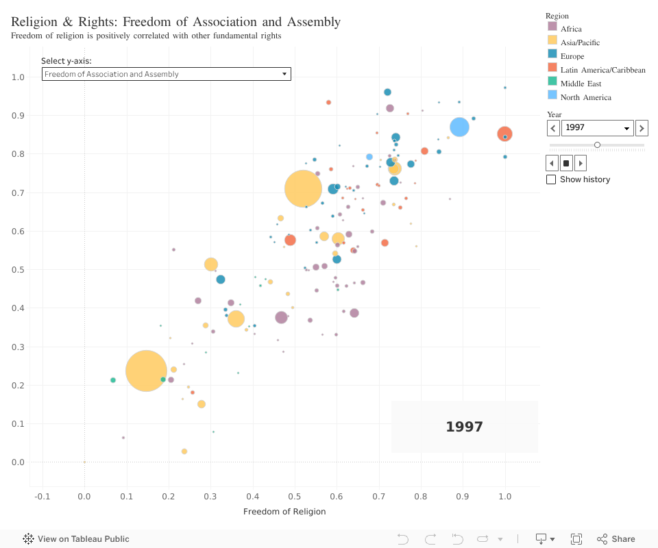
I was curious to see how religious freedom related to other fundamental rights, so I created an interactive visualization with Tableau to encourage exploration of these relationships. The user can select which fundamental right to view on the y-axis and can hover over bubbles representing each country (sized based on country population and colored based on region), to see the details for that country. The visualization can also be animated to watch changes over time, or the user may select a year to investigate statically.
Tip: To see an animation throughout all available years, pull the year slider (found on the right side) all the way to the earliest position. Then, click once on the right arrow below the slider. (This functionality -- animation -- may not be available on all mobile devices.)
Further work
This visualization is great for exploration and personal investigation of certain claims. What the viewer chooses to investigate will be a primary driver as to which conclusions this visualization will highlight. Further statistical analysis would be required to draw mathematically-backed conclusions. I think it would be interesting to review the effect of changing freedom of religion on other rights by doing a statistical test of hypothesis or time series analysis. Even linear regressions or correlograms could be insightful as to see which fundamental rights have the strongest positive correlation with religious freedom. Ultimately, there are many more analyses and visualizations that could aid in a more well-defined investigation of this claim, but even then this exploratory visualization could be a useful tool in defining what avenues of exploration warrant more rigorous methods.
Dig Deeper
Still want to see more of the process? Check out the full project on GitHub! (Note: This visualization was created entirely in a Tableau workbook, so there is not much relevant code other than the data pre-processing. However, the Tableau workbook can still be downloaded from the GitHub repository.)